

Interactive reading experience
Durga Tarot
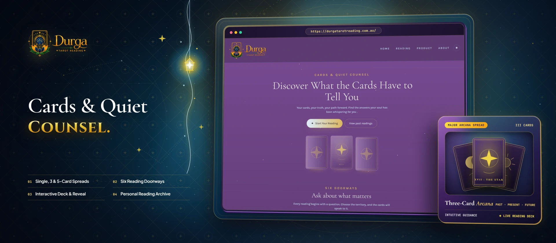
A tarot experience shaped around reflection, choice and a calm visual atmosphere. Durga Tarot pairs a purple-and-gold identity with an interface that introduces reading themes, card spreads and a clear starting point. The emphasis is on making an unfamiliar experience feel approachable from the first screen.
- Client
- Durga Tarot
- Project focus
- Interactive reading experience
An inviting starting point
A reading interface needs to establish atmosphere while making its choices easy to understand. Visitors may arrive with a specific question or simply want to explore. The experience introduces topics such as love, career, relationships and general reflection, giving each person a way to begin without presenting every option at once.
Atmosphere with structure
Serif typography, card artwork and a restrained gold accent create a visual language associated with tarot. The layout balances that atmosphere with straightforward labels and distinct sections. The main reading call to action remains prominent, while secondary information explains the choices available before visitors commit to a reading flow.
Choice at the centre
Single-card, three-card and five-card spreads give the interface a clear progression in depth. Topic cards organise the different reading themes, and a past-readings entry point gives the experience continuity. Light and dark presentation controls provide another way to adapt the interface to the person using it.
The experience
Durga Tarot presents an interactive journey rather than a conventional list of services. The design connects discovery, topic selection and reading depth within one visual system. Its language positions the experience as entertainment and self-reflection, keeping the framing consistent with the personal nature of the questions visitors bring.
Explore another perspective

Your next chapter